RESPONSIVE BUILD
Designed to fit. Built to work.
We turn the approved layouts into working pages that adapt to different screen sizes. Readability, navigation and the agreed interactions are all part of the build.
HOW WE APPROACH IT
Thought through.
Made clear.
We implement flexible layouts and check key pages at phone, tablet and desktop widths. Where a layout or image crop needs a different treatment, we adjust it deliberately.
WHAT THIS CAN INCLUDE
- Working pages within the agreed scope
- Layout checks across representative screen sizes
- Checks for overflowing content and broken assets
The specific deliverables are confirmed in your project scope before work begins.
SEE THE THINKING IN CONTEXT
Sunday Table
A café menu should remain readable on a narrow phone screen, while its desktop layout can make more use of space and imagery.
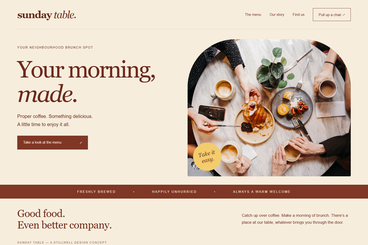 Explore the concept ↗
An illustrative concept for a fictional business, not a commissioned client project.